A balanced autumn bouquet starts not with a fixed list of flowers, but with three decisions: what mood should the colours create, which blooms should give the bouquet visual weight, and which airy materials should bring movement? Begin with a clear palette, choose one or two distinctive flower shapes, then add smaller flowers, grasses, seed heads or branches.
Orange, rust and burgundy are an obvious direction, but by no means the only one. Berry shades, powder pink, cream, green or a cool violet can feel autumnal too. What matters is that the colours and forms feel visibly connected – not that every shade resembles fallen leaves.
What makes a bouquet feel autumnal?
An autumnal impression often comes from a combination of richer colours and mature textures. Alongside the flowers are materials that can be easy to overlook in summer: grasses, fruiting stems and seed heads, rose hips, berried branches, changing foliage or sculptural twigs. They give the bouquet a texture that feels less smooth and more layered.
Dahlias, asters, chrysanthemums and sunflowers, for example, can provide focal blooms. These are design examples, not promises that any particular flower will be available on a given day. For the composition, the role matters more than the exact name: one large rounded bloom, several smaller flower accents and an element that extends beyond the compact outline.
Three colour directions for an autumn bouquet
Warm and tonal: apricot, rust, copper and burgundy
A warm palette feels particularly cohesive when the colours are not all equally loud. Apricot can provide the lighter starting point, rust or copper brings warmth, and burgundy brings depth. Dark green or brown-toned foliage connects the shades without introducing another main colour.
Tonal does not mean that everything has to be exactly the same colour. The gradation is what makes the combination interesting: pale peach beside muted orange, with a wine-red bloom or dark seed head. Limit the number of main colours so that each nuance remains visible.
Cool and berry-toned: plum, mauve, dusty pink and violet
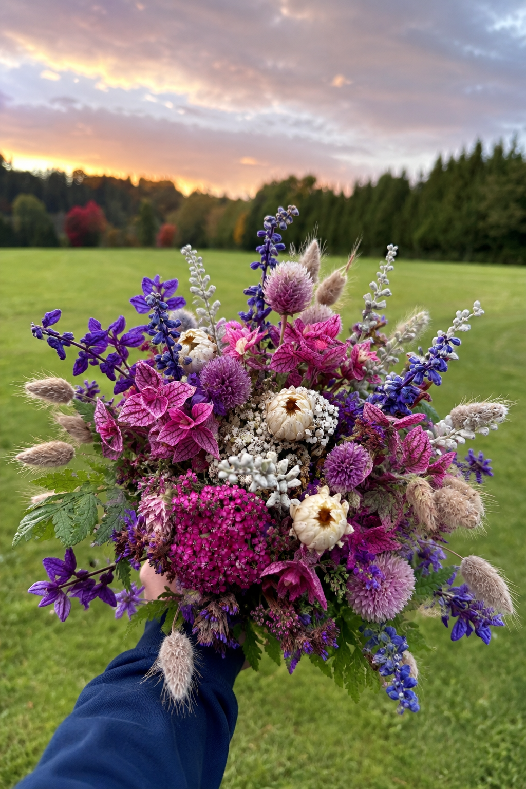
An autumn bouquet can also feel cooler and quieter. Plum, berry shades, mauve and dusty pink create a palette that feels more elegant and less rustic. A touch of warm-toned green or a small apricot accent can create deliberate tension among the cooler shades.
This is where colour temperature matters. A blue-based violet feels different from a red-toned plum, just as a cool blush differs from a peach-toned pink. To keep the direction clear, choose one temperature as the base and use the other only as a small counterpoint.
Light and natural: cream, pale yellow, green and brown
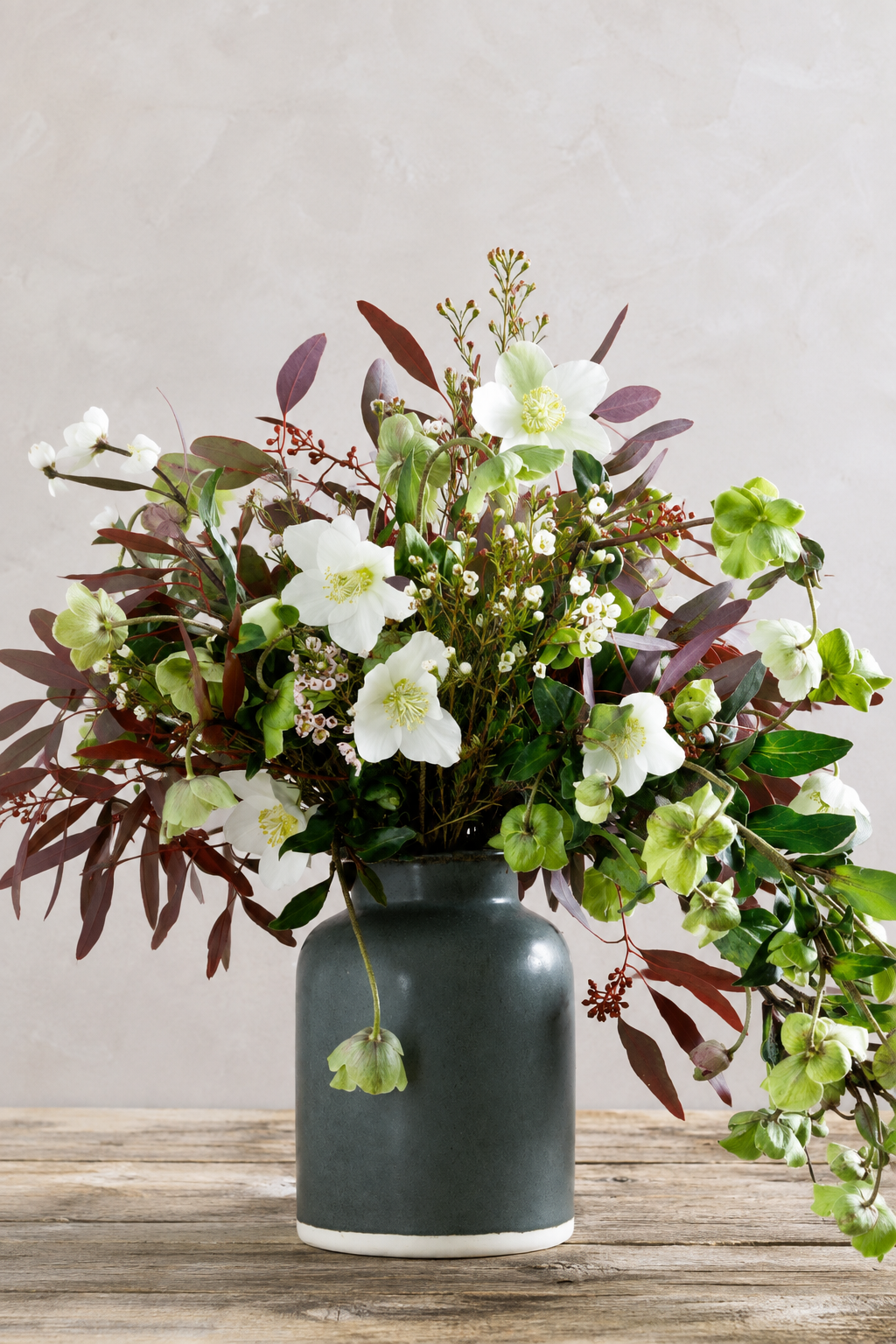
A lighter autumn bouquet does not require dark colours. Cream flowers, pale yellow, several greens and muted brown or beige notes create a calm, natural direction. Here, a seed head or the fine silhouette of a grass stem can evoke autumn more strongly than another saturated colour.
To stop a pale palette feeling flat, work with different surfaces: smooth petals beside matt foliage, a compact bloom beside an airy grass stem. The contrast then comes from texture and form rather than dramatic jumps in colour.
Which flowers work together in autumn?
Instead of searching for fixed flower pairings, choose the ingredients according to the job each one does:
- Focal blooms: Large dahlias, sunflowers or bold chrysanthemums can catch the eye first.
- Smaller flower accents: Asters or small-flowered chrysanthemums add repetition and connect the larger forms.
- Quiet support: Foliage and understated flowers create areas that allow stronger colours to stand out.
- Movement: Grasses and fine, branching stems loosen a compact silhouette.
- Line and texture: Branches, rose hips, berries or seed heads lead the eye outwards and give the bouquet a more mature character.
Not every role needs a different flower. A branching chrysanthemum can provide both colour and smaller flower accents; a dahlia can act as the focal bloom without dominating the whole bouquet. What matters is that five ingredients are not all competing for the same attention.
How to bring calm to a colourful autumn bouquet
If you love orange, red, yellow, violet and green all at once, let one colour lead. Repeat it at several points and treat the other shades as support or accents. This creates continuity while allowing the bouquet to remain colourful.
Contrast also reads more clearly when it is distributed unevenly. A predominantly warm palette with a few plum-coloured points feels different from one divided equally between orange and violet. The smaller counterpoint creates tension; the main colour holds the composition together. Autumn has more colours than pumpkin orange, after all.
Four questions to guide your choice
- What mood should the bouquet have? Warm, elegant, light, bright or calm?
- Which colour leads? Name one main colour or a close colour family instead of a long wish list.
- How much contrast would you like? A tonal palette feels cohesive; a small counterpoint makes it livelier.
- Which textures appeal to you? Mostly flowers and soft textures, or grasses, branches and visible seed heads?
With these four details, you can describe the autumn bouquet you have in mind precisely, without promising a particular flower. If you would like to keep browsing, go to the mixed flower bouquet collection. Use colour, mood and texture as your guide.